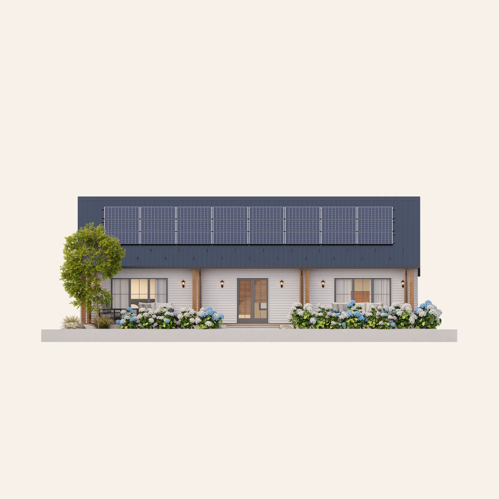
Panels

Quality without added cost
Building material at higher quality, delivered at or below the cost of stick-built.
Learn more

The Next Generation of Home Construction
The Haven brand kit, rendered. Every value on this page resolves to a value in the kit, so what you see here is what an agent gets when you point it at the folder.
What's insideThe kit
One brand section, delivered as plain text files and finished artwork. It is the single source of truth for Haven on the page, and it is built to be read by a person or by an agent.
Verbal
Voice, positioning, audience, messaging and concepts. The lines the brand has set, and the patterns behind them.
Visual
The logo system, the sub-brand lockups, typography, color, sizing, the layout system, art direction and video direction.
Interface
The components the identity resolves into on screen: the navigation bar, the three button treatments, the card, the icon set and the footer.
Assets
Logos and sub-brand lockups as SVG, two icon sets, twenty-four renders in two cuts, and the licensed font files.
Values
One JSON file authoritative for every visual value, and the custom properties generated from it.
Prompting
How to drive an agent with the kit, and the signature motif to check a surface against.
The kit is plain text and finished artwork. There is nothing to run and nothing to build: drop the folder into an agent and work from it. Rules and reasoning live in the documents, and every value lives in one place, so a number in a document can never drift from the number in the code.
The kit
Haven's signature is a single construction grid, squares crossed by 45 degree diagonals both ways, and the fact that everything in the identity is visibly built on it. Precision runs on a spectrum: exact at the mark, ordered in the layout, deliberately looser in the imagery.
90 and 45 degrees
For the mark and the icons. Horizontals, verticals, 45 degree diagonals, nothing in between. The strict end of the spectrum.
A modern grid
For layout. Type and image on ordered rows and columns: left aligned, evenly spaced, clear hierarchy. Looser than a lattice.
Classical angles
For imagery. Straight on, in profile, or on a gentle perspective. Never a severe isometric and never a top-down.
Square corners
No radius on a button, a card, a tile or an image. A rounded corner is the fastest way to look like another brand.
Blocks before content
Content sits on a block; the block sits on the grid. Blocks are drawn with grid lines and sit flush to one another.
Thin lines divide
Separate with a hairline where the order needs to show. Never a shadow, a border box or a tinted panel.
Verbal
Haven manufactures building panels that make homes cheaper to build, better to live in and worth more over time. The mission is the short form, the positioning statement the long one.
Mission
Our mission is to set the future of housing standards in America.
Positioning statement
We are setting the standard for residential construction in America by providing developers and contractors with building panels that deliver homes with unprecedented build efficiency, value, durability, energy performance, and investment quality.
The platform argument
01
The wall
Panels and framing, delivered at or below the cost of stick-built. This is what Haven sells today and where every page starts.
02
What runs through it
Mechanical, electrical and plumbing, integrated at the factory rather than fitted on site.
03
The energy it makes
Generation and storage, installed with the home and owned by Haven, so the home returns value for decades.
One continuous argument, never three separate offers. The order is fixed: the wall is what makes the rest possible.
Three audiences, one brand
Developers
Your partner for the future
We ensure you are building to the standards of the next 50+ years. They are buying cost and time of construction, sale and rental value, and the ongoing value of the investment.
General contractors
The best choice for construction
We make your construction offering more efficient and more appealing to developers. They are buying more jobs won, a smooth job process, margins held and relevance kept.
Residents
A quality stamp
When you move in, trust that it is the highest quality. They are buying a sound investment, affordability across energy, insurance and maintenance, safety from disasters, build quality and air purity.
Pick one audience per surface. A page written to all three states benefits that belong to none of them.
Verbal
Haven writes the way it builds: measured, specific and finished. Precision is the brand's form of care, so the writing earns trust by being exact rather than by being emphatic.
Precise
Claim the number, not the impression.
Plain
Short declarative sentences, ordinary words, no throat-clearing.
Proven
State what has been delivered before stating what is possible.
Consequential
Every technical fact carries its consequence.
The shape of a Haven sentence
Panels arrive cut, insulated and sequenced, so a crew closes a 2,000 square foot shell in four days.
Fact, then consequence, in that order and in one breath. Lead with the concrete noun: panels, walls, crews, homes and bills, never solutions, offerings or journeys.
Numbers are a set piece
Up to 40%
Energy reduction against stick-built to code
Four days
To close a 2,000 square foot shell
50+ years
The standard a Haven home is built to
The number stands alone and large, its label sits under it in one line, and the comparison lives in the label. Round to the precision the claim can survive. Three or six of these make a block; two make an aside.
Vocabulary
| Write | Not |
|---|---|
| panelized wall system | prefab, modular, kit-of-parts |
| panel | unit, module |
| stick-built | traditional construction |
| builder, developer, general contractor | customer, partner, client |
| MEP, spelled out on first use | services, utilities |
| home | unit, dwelling, product |
| the job site | the field |
Haven is a manufacturer, and it says so. It is not a technology company, a platform play or a disruptor, and it never describes itself as one.
Verbal
Six tiers, from the felt to the technical. Lead with the promise, support it with the pillar that matches the audience, and close on the functional benefit that audience is buying.
The promise
The System for Better Building
The one line. It is the default when a surface has room for a single statement.
The descriptor
The Next Generation of Home Construction
The line that says what Haven is, for a reader who has not met the brand. It names the category; the promise makes the claim. Set it in the H3 subhead style and in all caps, the one place H3 is not sentence case.
The pyramid
Essence
For life
Emotional benefits
Security · Empowerment · Comfort · Pride
Promise
The System for Better Building
Functional benefits
What it does for the project and the home
Pillars
The six specific features
Technical benefits
The same features, stated technically
A message is built by picking a tier and staying on it. Sliding from emotional benefit to technical benefit inside one paragraph is the most common way Haven copy loses its footing.
The six pillars
01
Building material at higher quality without added cost
02
Capable of building any design
03
Coordinated mechanical, electrical and plumbing components
04
Precise definition of MEP elements, and work before build
05
Ease of use on the job site
06
An expanding library of building elements
The pillars are claims about the system. Do not soften them into adjectives.
Verbal
The character behind the sentences, and the family of names the brand carries.
Persona
The American Builder
We believe American housing can be better through precision. Homes should be sturdy enough to endure, comfortable enough to cherish, and feel attainable without sacrificing quality. We work with the methodical confidence of someone who knows that exacting standards breed excellence.
Precision is the brand's form of care, not its form of pride: every technical claim exists because it produces a better home to live in. The argument always lands on the resident, even on a page written for a developer.
Brand architecture
Haven Panels
The sub-brand. The Haven Wall System is what it makes, and it is the thing a builder buys.
Haven Homes
The homes the system builds.
Haven Sub-Trades
The trades coordinated into the build.
Haven Power
Generation, storage, and the grid services that run on them.
Haven Insurance
The cover a better-built home earns.
Haven is the parent and it is never dropped. Name a sub-brand only when the surface is about that sub-brand.
Visual
A logomark, a wordmark, and two lockups built from them. All four are fixed artwork: they are placed, scaled and colored, never redrawn, retyped or respaced.
Primary lockup
The default signature, and any official application.

Secondary lockup
A wide format, or a layout with limited height. Same authority, different proportions.

Logomark
A surface that already carries the brand, where recognition is enough.

Wordmark
The name alone, in running brand material.
The three logo pairings
Lead with these three and reserve anything else for a genuine exception. No secondary color ever enters the logo. Clear space is the mark's own geometry, not a step on the spacing scale: one extended hexagon, 40% of the logomark's height, on all four sides.
Visual
Haven's sub-brands are carried by icons, and each icon locks up with the Haven wordmark. One idea repeated: every icon is drawn on the grid that built the logomark.
Every icon is drawn on the grid that built the logomark, so a sub-brand reads as part of Haven before it reads as itself. All four are drawn to one height and vary in width: size by height and let the width fall where it falls.
The lockups

Panels
Interlocking sliding panels

Power
A lightning bolt

Steel
Steel beams

AI
A computer chip
Place the finished artwork. Never rebuild a lockup from the icon and the wordmark: the relationship between the three parts is fixed in the file, and an assembled version is wrong even when it looks close.
Visual
Two families. Akzidenz-Grotesk Extended is the display face and its squared, extended forms give headlines their geometric character. GT America is the workhorse, with the mono cut carrying eyebrows, captions and small type.
Display
AaBb
Akzidenz-Grotesk Pro Medium Extended. Squared, extended forms, all caps. It sets H1 and H2 and nothing else.
Body
AaBb
GT America, roman and italic, in two weights. The regular cut sets running text; the bold cut sets H3 and emphasis in a paragraph.
Mono
AaBb
GT America Mono Bold. Eyebrows, captions, button labels and small type. All caps, always.
The five type styles
Face, case, tracking and line height are fixed by the system. The heading sizes are the surface's own, so a row states the token it reads rather than a pixel value. This page sets its four in one place, beside its spacing base.
The paragraph scale
Three fixed steps, the same at every surface. Pick one per block and hold it.
Visual
Black, white and neutral tones with a single accent. Carbon carries text and backgrounds, off-white grounds backgrounds and reverses type out of dark fields, and orange is the accent and the most identifying color in the system. Click any swatch to copy its value.
Primary
Secondary
Neutral ramp
Utility
Approved pairings
Type takes the first color, ground the second. The logo leads with the first three of these and reserves anything else for a genuine exception.
Visual
One spacing ratio and only one: a small interval, and a large interval six times its size, repeating unchanged down a module. The scale is built on that pair, and a surface sets it up by choosing one number.
One ratio
The large interval is six times the small one, and both repeat unchanged down a module. The other three steps are that pair halved and doubled, which is what keeps a component and a page on one rhythm. Pick the interval by what it separates, never by how the gap looks.
The text stack
Precision pre-build
Panels arrive cut and sequenced
The eyebrow sits space-half-x above the
heading because it belongs to it. The paragraph sits
space-2x below, because it is a different level.
Visual
A Haven layout is built like a building, from a blueprint. Three layers, in this order, and the order never changes.
01 The grid
It anchors every element. The surface picks three, two or four columns and holds that count for every layout on it.
02 Blocks
Containers sit on the grid, sectioned off with thin lines. Equal importance gets equal width; hierarchy comes from proportion.
03 Content
Imagery, color, typography and graphics sit on the blocks. Images run full bleed to their container; type sits inside ample padding.
The web module
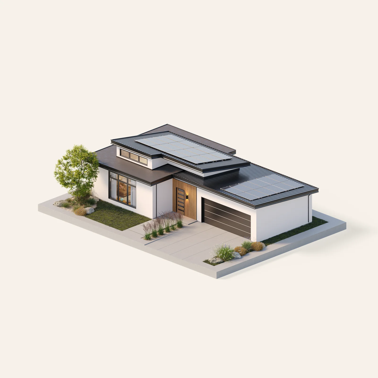
Capable of building any design
One system, every house type
The panels carry the structure, so the design is free. A gable, a flat roof, a two storey elevation and a long porch run come off the same line and out of the same library of elements.
See the componentsA full-bleed image on one side, left-aligned type on the other, on a two-column grid. Type registers against the block edge, which is why it is left aligned.
Visual
Every image is rendered in true isometric perspective or in a straight-on view, never a casual angle. Parallel lines stay parallel and nothing converges on a vanishing point. The perspective is chosen so the structure is legible, not so the shot is flattering.
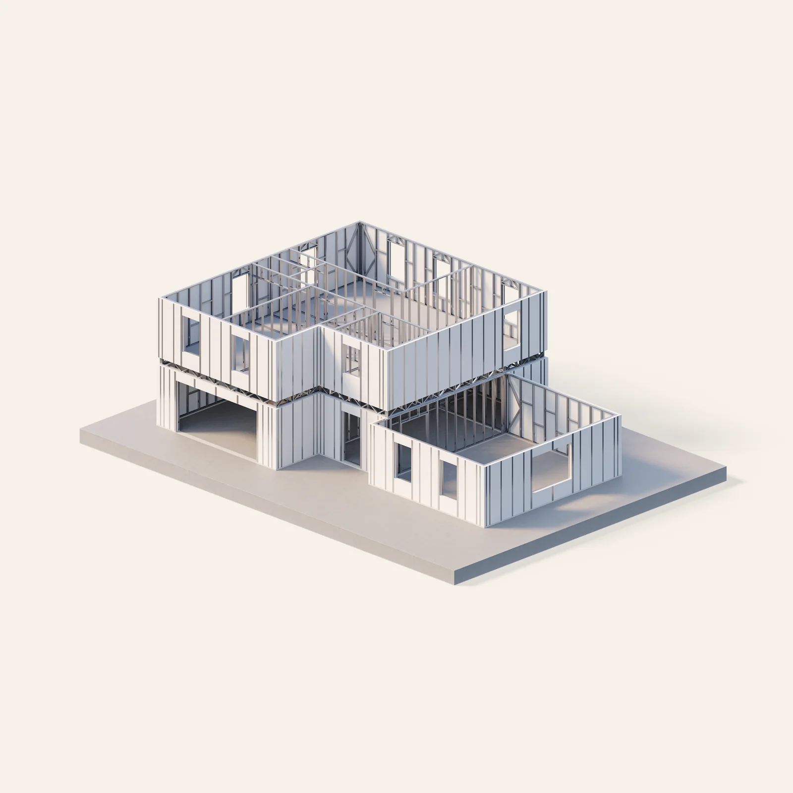
In development
A house mid-construction. The projection exposes the structure rather than hiding it behind a finished facade.
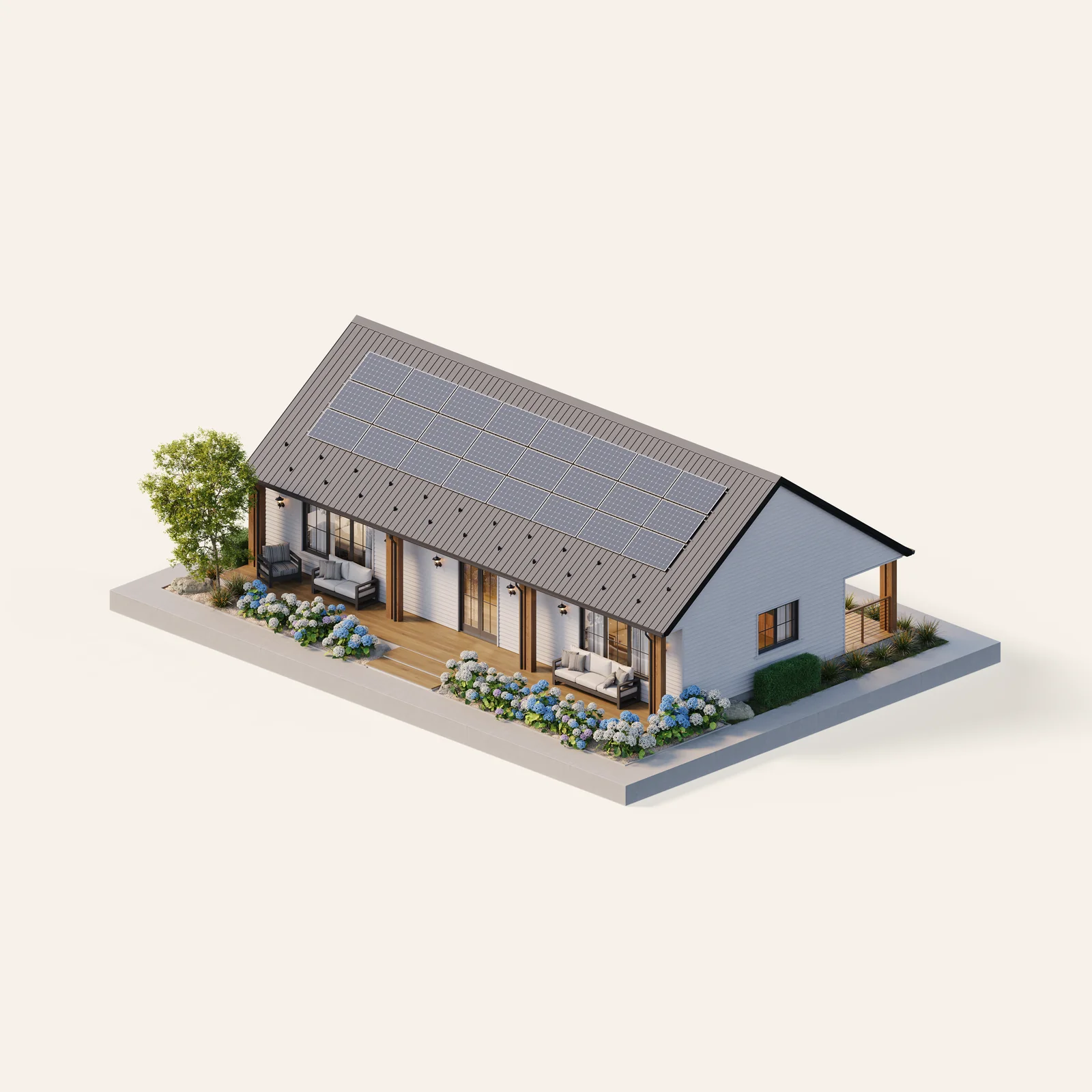
Finished houses
Complete houses isolated on a seamless neutral ground, each a different style the system can build.

Panel variety
Straight-on shots of the panels, flat to the camera, showing the textures that lay over a panel's face.
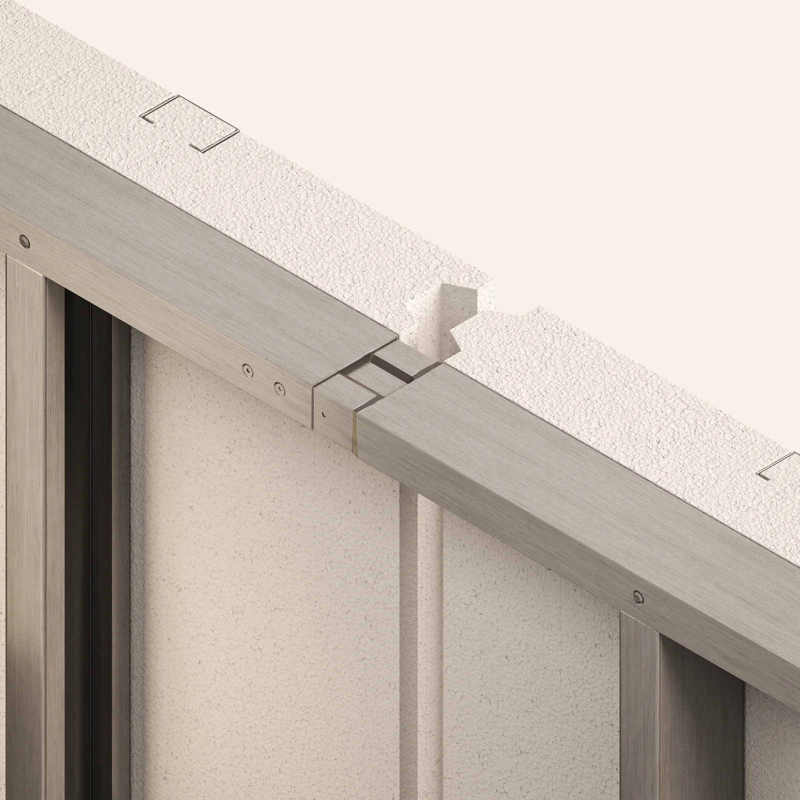
Detail crops
Close crops on the precision-milled joint where two panels register and lock into place.
Range, on one ground
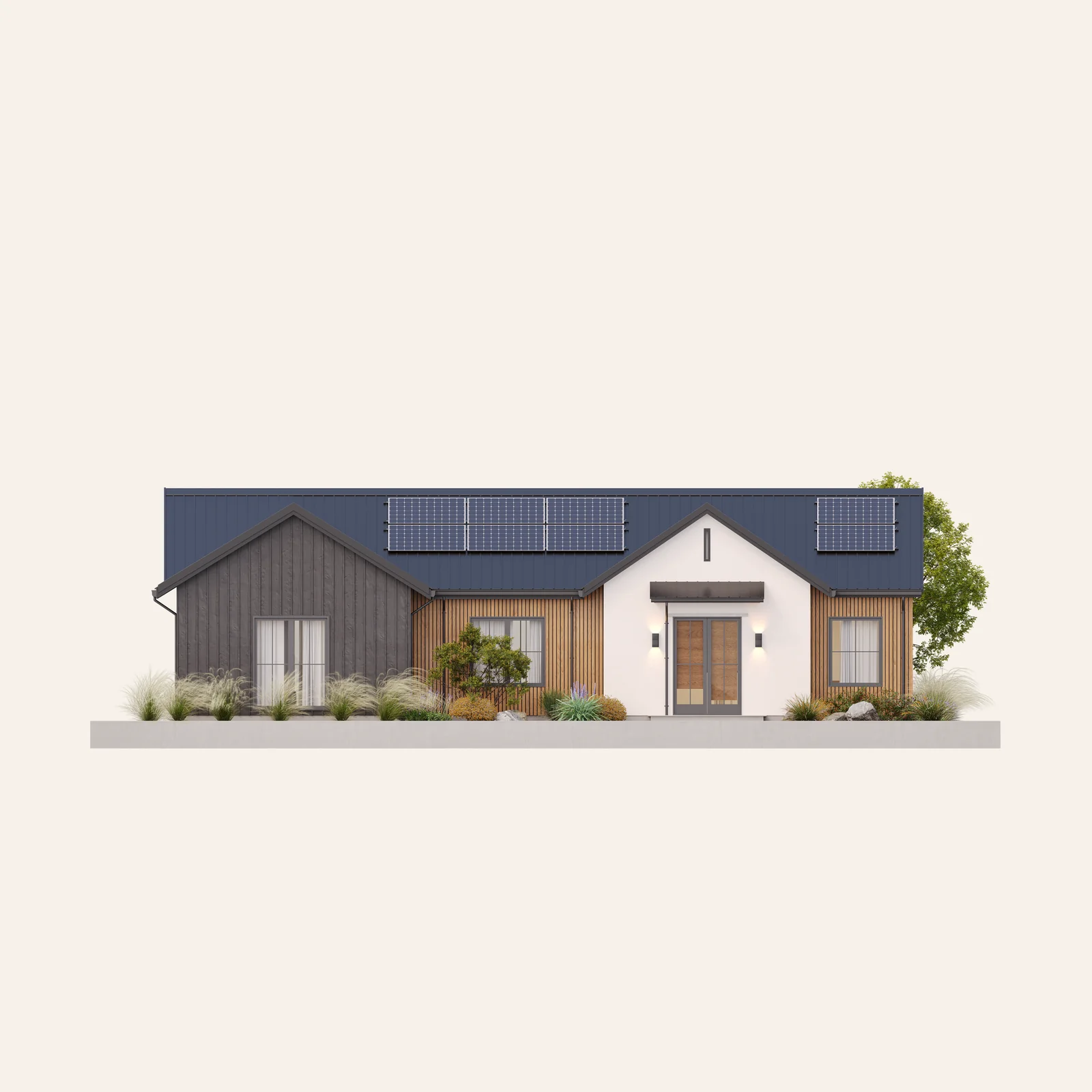
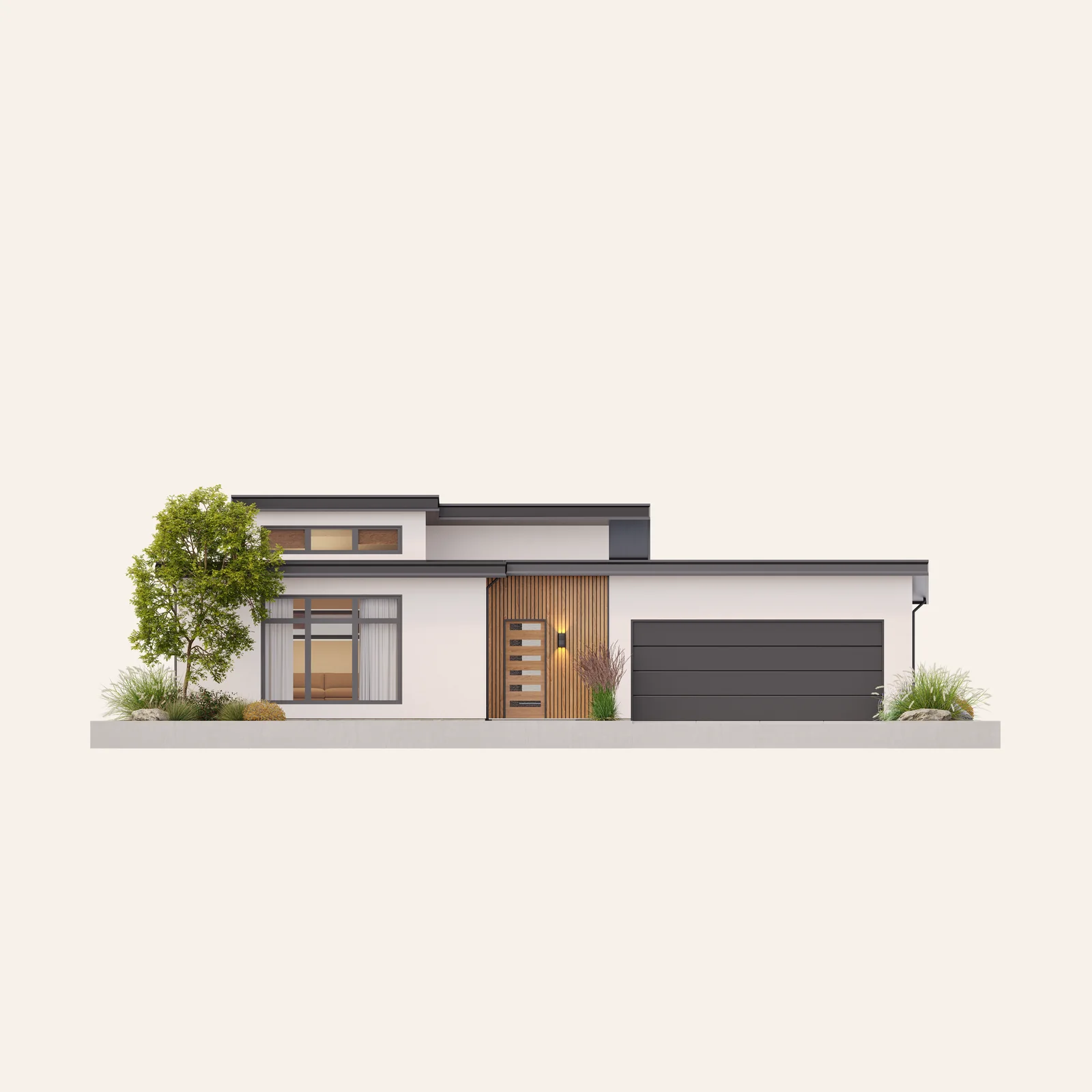
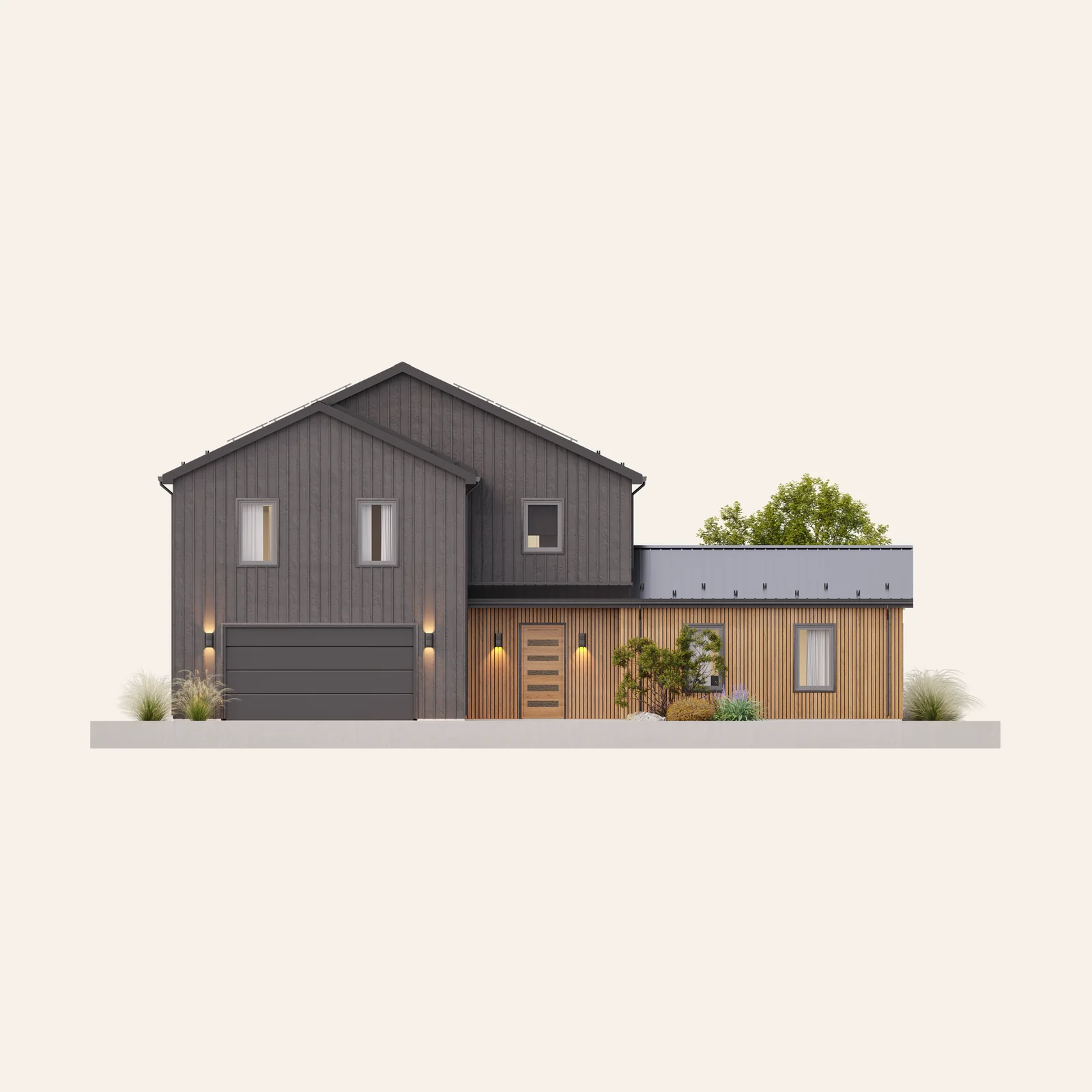
Twenty-four renders ship with the kit, named by set, so a glob picks a set. Every image is opaque and sits on its own flat ground, which is why it goes in a block rather than floating on a fill.
Visual
Video sets Haven's mood at scale, and it conveys the grandness of the construction more than it conveys any single subject. Shots are deliberate and uncluttered: one subject, given room, held on purpose.
Sunrise
Warm light and long shadows, for an optimistic tone.
Bright daylight
Clarity, the work seen plainly.
Black and white
Attention on the construction and its precision engineering.
A piece picks one treatment and stays with it. Light the work atmospherically: flat, evenly lit footage reads as documentation rather than as the brand. This direction governs film only, and never sets interface motion.
Interface
The components the identity resolves into on screen. They hold to the primary palette and they carry no fixed pixel heights, so a component holds at any surface base.
Navigation bar
A solid carbon square holding the logomark, flush to the top and left of the bar and running its full height. It is the only place the mark sits in a filled tile, and the only place a mark is not registered on the first column.
Call to action
One button, three treatments: accent for the primary action on a light surface, solid where the accent would compete, quiet for a secondary action and for anything sitting on a filled surface. One accent button per view. Corners stay square.
Web icons
Guaranteed savings
Backup outage power
No maintenance
Energy independence
Solid shapes in carbon, detail cut out of the solid so the ground reads through as the counter. Every icon in a row is set to one height, five times the label's font size, and its width follows from its own proportions. They share a height, never a box.
Platform component card
Panels
Quality without added cost
Building material at higher quality, delivered at or below the cost of stick-built.
Learn moreSub-trades
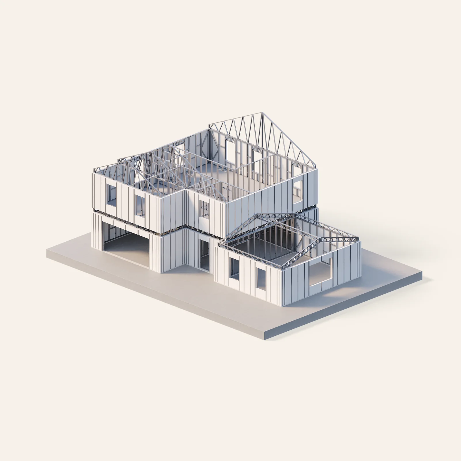
Coordinated MEP components
Mechanical, electrical and plumbing defined to the millimetre and integrated at the factory.
Learn morePower
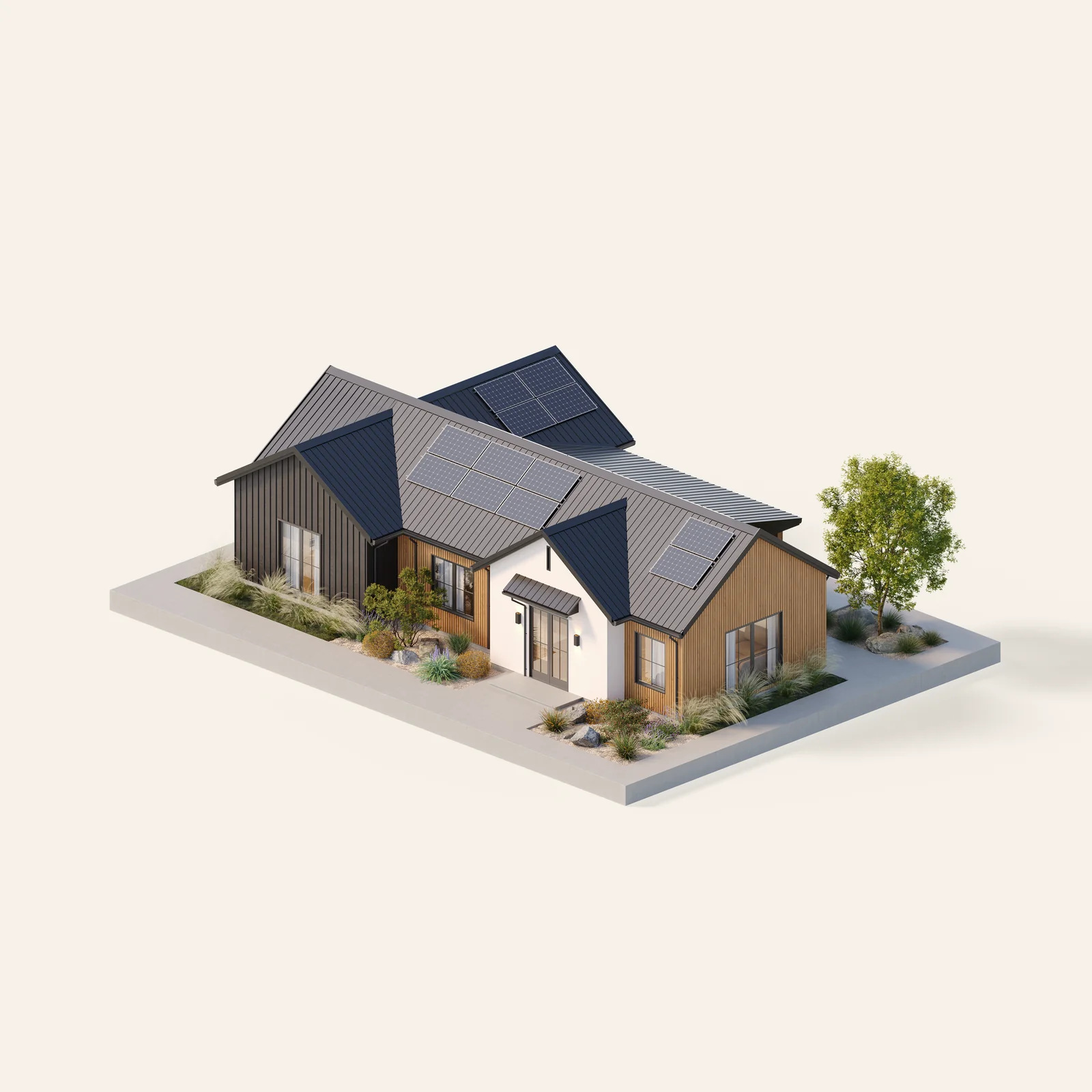
Energy the home makes
Generation and storage installed with the home, so the home returns value for decades.
Learn moreCards sit on the grid as equal blocks, separated by thin rules, with a rule closing the row beneath them. No border, no radius, no shadow: the block system draws the separation. The image is the only place a card carries color.
Interface
Every value in the system, generated from the one file that holds them. Click a row to copy its value.
| Token | Value | Group | |
|---|---|---|---|
| --orange | #F68638 | color · primary | Copy |
| --off-white | #FAFAF8 | color · primary | Copy |
| --carbon | #141719 | color · primary | Copy |
| --white | #FFFFFF | color · secondary | Copy |
| --clay | #D8D2C8 | color · secondary | Copy |
| --steel | #8C9397 | color · secondary | Copy |
| --neutral-100 | #141719 | color · neutral | Copy |
| --neutral-90 | #34383B | color · neutral | Copy |
| --neutral-80 | #4C5154 | color · neutral | Copy |
| --neutral-70 | #63696C | color · neutral | Copy |
| --neutral-60 | #787F82 | color · neutral | Copy |
| --neutral-50 | #8C9397 | color · neutral | Copy |
| --neutral-40 | #A1A7AA | color · neutral | Copy |
| --neutral-30 | #B6BABC | color · neutral | Copy |
| --neutral-20 | #D1D4D4 | color · neutral | Copy |
| --neutral-10 | #EDEEED | color · neutral | Copy |
| --success-100 | #005C31 | color · utility | Copy |
| --success-80 | #009951 | color · utility | Copy |
| --success-50 | #5FAB87 | color · utility | Copy |
| --success-10 | #ABBAB3 | color · utility | Copy |
| --alert-100 | #8B6F1D | color · utility | Copy |
| --alert-80 | #E8B931 | color · utility | Copy |
| --alert-50 | #D3BB77 | color · utility | Copy |
| --alert-10 | #C2BDB0 | color · utility | Copy |
| --error-100 | #7D2121 | color · utility | Copy |
| --error-80 | #D03737 | color · utility | Copy |
| --error-50 | #C77A7A | color · utility | Copy |
| --error-10 | #C0B1B1 | color · utility | Copy |
| --font-display | 'Akzidenz-Grotesk Pro Extended', system-ui, sans-serif | type · family | Copy |
| --font-body | 'GT America', system-ui, sans-serif | type · family | Copy |
| --font-mono | 'GT America Mono', ui-monospace, monospace | type · family | Copy |
| --weight-display | 500 | type · weight | Copy |
| --weight-body | 400 | type · weight | Copy |
| --weight-body-bold | 700 | type · weight | Copy |
| --weight-mono | 700 | type · weight | Copy |
| --tracking-h1 | -0.02em | type · tracking | Copy |
| --tracking-h2 | 0em | type · tracking | Copy |
| --tracking-h3 | 0em | type · tracking | Copy |
| --tracking-body | 0em | type · tracking | Copy |
| --tracking-eyebrow | 0.08em | type · tracking | Copy |
| --leading-display | 1.07 | type · leading | Copy |
| --leading-body | 1.4 | type · leading | Copy |
| --leading-eyebrow | 1.4 | type · leading | Copy |
| --text-p1 | 32px | type · size | Copy |
| --text-p2 | 24px | type · size | Copy |
| --text-p3 | 20px | type · size | Copy |
| --space-half-x | 8px | space | Copy |
| --space-x | 16px | space | Copy |
| --space-2x | 32px | space | Copy |
| --space-6x | 96px | space | Copy |
| --space-12x | 192px | space | Copy |
| --rule-weight | 1px | line | Copy |
| --rule-color | #B6BABC | line | Copy |
Four sizes are absent by design: --text-h1,
--text-h2, --text-h3 and
--text-eyebrow belong to the surface. Each surface sets them
once, beside its spacing base.